Previous Posts

Wednesday 24 October 2012

XB2001 - Level Completed


At last I have (hopefully) completed my level, complete with plenty of paths and for any eager free roamer complete with a stealth path where an assassin can avoid killing as few people as possible.

In it's current state the level is complete with all mechanics being used at some point with crowds and benches available for the player to blend into along with hay bales, wells and roof gardens available for the player to hide in as well.

Top view of Vienna
As guards and general civilians are all over the city it does seem a bit pointless to include each and every one in my level design as I felt that it would be self explanatory that there would be civilians and guards dotted around everywhere with higher concentrations the closer towards the middle. Furthermore I felt it unnecessary to include guards and patrol paths around the city as they're not going to attack you straight away, however there are guards placed in the restricted area as they would be stationary and would obviously be of importance since these are the guards who are most likely to attack you.

Key: Grean = Crowd, Yellow = Hide-able Areas - Roof Garden, Hay Bales, Well, Benches, Red Area = Restricted Area, Blue = Water, Orange = Quick Run Startups
I felt that as the player begins from the docks area as he has just entered the city to hunt down his target I thought it would make sense for him not to have any allies available to hire as people don't know how the foreigner is nor would they want to work for him.

3D Render of Vienna after being exported to 3DS Max, very messy render and to be honest it was a bad inefficient model to begin with and I did struggle to even place lights in the scene the model was breaking 3DS Max so much.


Next thing for me to do now is a level walk-through, where I shall take a step by step look at how each player can go about completing the task.

XB2001 - Level Design Update

Quick little update post, I have all the buildings placed and also have heights to them now so now what I mainly want to focus on is placing the hide-able areas, players, crowds and crowd paths as well as enemies. Additionally I feel that I may need to take another look at the possible approaches a player may take so that I can have all the building heights similar so that it is easier for the player to traverse to the target.

Vienne,1500s
I am quite pleased with how it is turning out so far, I just hope that my tutor doesn't ask me to place any more buildings so I can focus on creating an actual play through.

XB2001 - Level Layout


Above is the beginnings of my level for an assassin's creed game set in Vienne, Austria, where our assassin is after a corrupt politician who's visiting the city's Bath House to relax.

Obviously I'm not going to model an entire city as many of the buildings would be unusable but as Assassin's Creed is a very open and free roaming game, allowing players to attack from any direction I will be creating buildings from a large radius around the main target area, which will be the bath house building.

My main aim here is to create a level that hasn't been quite seen before in the assassin's creed level, whereby players can decide whether they wish to go for an all out assault through the front entrance, sneak in through the viaduct avoiding killing guards (who are at the end of the day are just doing their job), or something in between such as jumping onto the rooftop from a neighboring building.

So currently I am just worrying about the layout of the city, as I want it to have some main routes along with narrow passageways throughout the city, with narrower and windier paths closer to the centre, giving a feeling that the player is in a congested and urbanised area, but also to make it easier to break line of sight with pursuers near areas with guards.

Once I have the buildings and the city layout finished I then will worry about placement of hay bales and hide-able areas, leap of faiths, and other features of the game.

Monday 22 October 2012

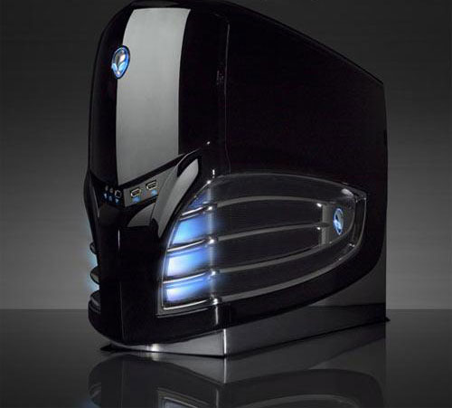
DD2000 - A Look at Design: Alienware


Alienware are one of the most well known brands when it comes to high-end, high performance laptops. Their laptops do look very nice indeed from the outside with the changeable lights on the outside, and the sleek yet subtle industrial feel giving the user a feeling that they are wielding a mighty machine.
 
The internals are also quite impressive featuring usually what is the latest processors, graphics card and RAM available for laptops as well as a variety of storage drives. The online process of ordering an Alienware is also very well designed, where customisation was the main aspect the website design team must've been going for, allowing consumers to choose exactly what they want inside their laptop whilst providing little snippets of info to inform the user, what a particular part of the laptop did and how important it was.
  

However that us where the pros end in my opinion, whilst they are great pieces of hardware no doubt, they are also very very expensive for what seems to be no reason at all. A 17" Alienware laptop with sufficient, not the best, sufficient internal hardware would cost you close to £1400. Prices decrease the smaller screen size you go for, which in all sense and purposes should make the laptop more expensive, as there is less room for hardware to be stored and the company must use smaller parts. Part of the reason why the range of laptops are as expensive as they are is because you are effectively paying for the Alienware name, similar to paying for a Mac from Apple. However best of all is that it's not even Alienware, not since Dell bought the company and has been controlling things ever since. To which you might as well buy a Dell XPS since you can fit the majority of an Alienware's internals into one and you're not paying for a name.


Or of course you could always go for a laptop from pcspecialist.com since there you're getting the same great fast running internals of an Alienware for much less.

Disclaimer: pcspecialist.com does not sponsor this blog post.

DD2000 - A Look at Design: iPhones


The iPhone is one of the most well known series of phones with various models at various prices and with different amounts of storage giving consumers quite a choice for an iPhone. Although are they really as hyped up as people make them out to be?


First impressions with an iPhone are good with a very sensitive and accurate touchscreen, meaning you're never having a mistype in a text of a misfire in a game. The iPhone comes with it's own Appstore giving iPhone users exclusive apps as some companies may prefer to release an App for the iPhone it's rivals such as Android or Windows. The firmware of the iPhone is also very user friendly with apps and Games easily being displayed with a spaced out grid-like system meaning users easily find what they are looking for and can even rearrange the order of their apps or even create a folder which they can then name and store their apps inside to save room on their homescreen. However as far as customisation goes, that is all the iPhone has to offer, aside from being able to set your homescreen background which is something phones have been capable of for some time.

Addtionally an iPhone can be quite costly with the new iPhone 5 at PRICE, which for a phone that is only slightly more impressive that its predecessors is quite a lot. This due to the fact that yes, the iPhone 5, and the majority of iPhones for that matter, are quite costly t make, however the high cost is mostly due to the fact that Apple know that people will pay that much for an iPhone.


iPhones are somewhat of a bragging right to some people, and to them they must have the latest version (or close to it) no matter the cost because they feel they need the new iPhone. Not want, need. Which it in itself, presents the iPhone as a product very successful as people do see them as a step above the rest and they do feel the need to own one depending on the person's perception of the iPhone.

The iPhone is a well designed phone on the outside, it is very ergonomic, especially in the earlier series, with it's compact and thin design and it's responsive screen. However on the inside lies what is, granted, an easy to navigate homesceen, but there is close to no personal customisation options for it. Which in a world where people are able to create social profiles on websites and change their profile picture, give themselves a cover photo and even in some cases edit the layout of a webpage only comes across as being quite restrictive.

In conclusion, the iPhone is well designed on the outside and physically at least on the inside, however it suffers in it's firmware.

Thursday 18 October 2012

XB2002 - Mk3 Bertie Mode A Sketch

Sketch is complete! Didn't take very long as I'm currently attempting to speed up my workflow and care less to small fine detail that the human eye doesn't normally notice.


I am very happy with the sketch as I was able to do it quickly whilst maintaining some form of standard throughout. Unfortunately the shotgun isn't exactly straight nor do the lines of text quite follow the curvature of the robot's main body.

Next step is then to begin creating the actual 3D model which hopefully will turn out even better than this (sorta?) did.

XB2002 - First Assignment


 After getting back into grips with 3DS Max and modelling using more than one object I have been given my first assignment of the year.

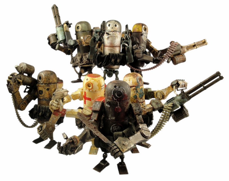
It is to create a 3D model of one of Ashley Woods' robots from his World War Robots series, and then to texture and use some basic rigging to get it set up into some poses. I am thrilled to have this assignment as the robots themselves do look fairly basic in certain areas but more importantly, they look badass.


Although before I can start to model I must first choose a robot and then do a quick sketch of it, as well as create blueprints of it to aid me in the modelling process. Although choosing a robot in itself is a rather hard task in itself as all of them do look very very good indeed and there is quite a variety of them.


Although I'm not a huge fan of big heavy clunky things that I would deem slow and ponderous (not to mention a tad overkill) I am going to go for the Mk3 Berties, mode A, i.e. the one with a spas-12 shotgun, as I really like the proportions of the robot and I think it just looks great whilst holding a shotgun and hip height.


Wednesday 17 October 2012

XB2178 - Initial Research


Above is a moodboard to emphasis what I wish for my tank to look like from looking at different aspects of different sources. Above are Ashley Woods' robots, some concept artwork along with even a poster and a tank from word art.


 Additionally I will be looking at tanks from the comic book called Sandland as it has a very stylised look to it and certain aspects and proportions are exaggerated. This is used to emphasise what the purpose of the tank is, for instance in the case above, the tank has lots of space and so it's main use would be transport. Similarly, the main aspect of Woods' robots would be how bulky and durable they are, and that they're built to last whilst having short legs, emphasising how slow and ponderous they  are. Additionally the tank from Gears of War has large wheels and a large turret suggests that the tank plays an offensive role whilst being maneuverable.

From looking at the sources above I have a better idea of how I should go about designing my stylised tank and it's crew. Additionally, a lot of the stylised tanks are made up from basic shapes, for instance looking at Woods' it can be clearly seen how the are made from mostly a cylinder with cuboids for limbs. From looking at these tanks I have gained a greater understanding in how I should go about designing my tank and its crew by looking at what the role or class of the tank and its crew is, be it Reconnaissance, Transport, Assault, Medical, Sniper, or Heavy.

Tuesday 16 October 2012

XB2178 - Project Plan Draft


Aims

My aim for this project is to create at least one diorama featuring a tank and its crew of 3 performing in a scene. This scene could be the 3 men arguing which way to go whilst looking at various maps or performing maintenance work on the tank in a hanger of sorts. This will be done using low poly models and a stylised style to suit the models. Finally I will then print these off as A3 final pieces, although alternatively I may create a short animation which would feature the tank slightly rumbling and possibly limb movements from the crew, although definitely nothing too complex, depending on how much time I have.

Intended Actions

Firstly I will do research and design in order to create a stylised tank with a matching crew, during which I will look at other artists' work and draw some sketches. Once I know what my tank and crew will look like, I will then create detailed blueprints for modelling the tank and 3 crew members. Next I would then texture and rig the models so that I would be able to place them into a pose. Finally I would then work on using light sources and creating a quick environment piece for them to be situated in.

Outcomes

At least 1 printed diorama featuring the tank and crew. Additionally I may create a small animation which would feature the tank slightly rumbling and possibly hand and arm movements from the crew.

New Skills and Knowledge

I will gain the necessary knowledge and skills to successfully rig 3D models and also how to properly render a 3D object using different light sources and possibly after effects such as depth of field etc.


Project Timetable

Present - Nov      Research and Design, Complete Sketches for Tank and Crew Design
Nov - Dec           Create templates, Model, Texture, Possibly Rig
Jan - Feb             Rig Models and Begin Research into Dioramas and Set Pieces
Feb - Mar            Set models into desired Poses and create renders. Create short simple animation if I
                            have plenty of time

Monday 15 October 2012

XB2002 - Medieval House

For our first task after returning to university after summer I was to create a cartoony medieval house with hand painted textures. For this I did some preliminary sketches as well as looking at some examples of a cartoony house.


I really liked how the buildings seemed quite top heavy and were quite tall, as well as the detailing of the wooden panels going across the buildings


Again here you can see how the building is a little top heavy and has wooden panels for structural support, but I also like how the bottom and the foundations of the building seem to be made of stone.


Here are my sketches I did of my house, even though they may be hard to follow it still did really help me imagine what kind of medieval house I wanted to make and all of it's little features.


And finally here are the renders of my final piece of my Medieval House, I am quite pleased with how it turned out and I learnt quite a lot about unwrapping and rendering 3D models as I had to restart the unwrapping process 3 times as I would realise there was something wrong with my 3D model, and after fixing the fault all my UVs would have reset themselves, however thankfully now I know to collapse all of my object before doing so, so that my UVs become saved.


Above is a render with no materials on the object and I am very happy with the result as the model looks significantly better than previous work last year. Although I do need to practice more with lighting and shadows whilst creating renders.


Here is a render with the hand painted materials added onto the house which really brings it to life. I am very happy with the final outcome as I my skills in 3D modelling and digital painting have strengthened significantly.

The texture sheet that I painted for this task

The Nice Face makes a triumphant return with "Ye Olde Nice Tavern"


Front view of the Medieval House


Rear view of the Medieval House


It was quite an interesting task as it really was the first time I had created a model using separate objects as normally I would create a model using 1 object. With this came some slight problems that I was able to over come such as polys overlapping each other and causing a flickering effect in 3DS Max. Although I was very happy to create something with more than one object as it made certain things much much easier such as the little extensions jutting out of the house.


Thursday 11 October 2012

XB2001 - Level Design Project

Our next project is to create a level design document featuring a level that we have designed and created that could be used within an existing game, and so it would use the game's already existing mechanics.

For this task I have chosen Assassin's Creed, 2 to be precise, although I had aimed to possibly create the level out of the normal time of the Assassin's Creed series to a different time if I feel at a later stage that it would benefit the level and make it an even more exciting play through.

As Assassin's Creed is quite an open game with lots of freedom to move I felt it was important to make note of the game's mechanics such as free running etc so that I may include all of the game's mechanics within my level to make it as interesting as possible.

The mechanics are as follows:
  • Free running- Climbing up walls, running along rooftops etc worth a note is the quick run areas where a player can easily build up momentum and get access to higher buildings quickly.
  • Combinations in combat, players could fight whilst being surrounded
  • Hiding Places to break line of sight of chasers, eg hay bales
  • Areas on rooftops to do a "Leap of Faith"
  • Eagle Vision to identify enemies and targets
  • Pursuit, cant lose line of sight of an enemy for too long
  • Pick pocketing
  • Enemy Morale, can be broken to cause other enemies to flee
  • Crowd Blending and Allies, to aid in infiltrating areas.


    Additionally, what I think is a good note would be to work backwards from a player's main goal for instance, work out what the player's main target is, then consider the target's location and it's surrounding area and then how the player gets there etc.

    In order to get a sense of how the level should possibly be laid out I will look at screenshots and concept art from within the series to gain a sense of how high buildings should be and how concentrated these buildings are.

    Large open square which featured crowds of people to blend into in the actual game.

    Fight scene showing how densely populated the areas can be as well as allies you can hire.
    Map of Florence, which gives me a sense how far apart major structures should be spaced. Additionally this has also just reminded me all the collectibles within an Assassin's Creed game that I will also need to include.

    A good reference photo of how high and dominating some structures can be within the game as well as how high other structures should be.


    Another map showing the layout of the Venice section in Assassin's Creed 2. This map is very helpful as it shows how sometimes an environment could be made up of lots of clusters of buildings whilst being linked together.

    From looking at past Assassin's Creed's maps and having played through the environments myself I think that even though there is a freedom to attack a target from any angle, there is no incentive to do so. Sneaking past guards never seemed to reward me as a player other than the fact I got to kill my target a different way. For my level design document I will give players incentives to go either which way such as a bonus reward for attacking from range such as a bow, or a battle axe for a frontal assault etc.

Wednesday 10 October 2012

DD2000 - A Look at Design: Touchscreen Desktops

Touchscreen technology has been round for some time, and over the course it has significantly improved from jerky responsiveness or else not picking up user interaction at all, to clean, slick, concise interaction with the touchscreen device, most notably tablets and smart phones.


Understandably companies with touchscreen technology would indeed want to expand this tech over to other products to make them more stylish, more high tech and more desirable to consumers. Since there have been touchscreen iterations of TVs, watches, mp3 players and even keyboards and mice. All of which are viable applications of the technology, it does allow for friendlier user interface in certain devices, whilst being slightly overkill, but still stylish, in others.


 However there is one device that the touchscreen capability does not suit, and indeed the capability is neither needed nor desired. Of course I am talking about touchscreen desktops, PCs redesigned so that they resemble a Mac in that the whole device is together in one and there's no need for a consumer to buy a separate monitor, with touchscreen capability. Initially the idea may not seem bad, up until you realise that the angle at which a monitor would normally sit at is slightly more than 90 degrees. This upright position combined with the fact that a user would have to constantly be lifting up their arm to do a simple gesture results in a sore wrist or arm from a pointless, gimmick used only to encourage people to foolishly buy them.

Looks uncomfortable, doesn't it?


Some touchscreen desktops now do include the feature of tilting back to make the product slightly ergonomic which will definitely improve the product. However the main downfall is that there is no support in the form of software or even apps for touchscreen desktops as people struggle to hit the scroll bar on a website with their finger. Even when simple tasks such as scrolling down a webpage is proven difficult, the product simply fails to meet the desires of the consumer and would only be an effort to use.

In conclusion, touchscreen desktops are a horrible piece of design with next to no thought for user comfort, making it a very user-unfriendly piece of design. However with the release of Windows 8 and a more ergonomic redesign, it may become a much better piece of design in the future.


DD2000 - A Look at Design: Self Service Checkouts

This is the first of a series of blog posts whereby I will simply look at a piece of design and analyse it to determine whether or not it is a good piece of design or a bad piece of design. To do this I will look at both the good and bad and also look at whether it has been designed well for the people who are most likely to use it.

To begin we shall have the ever exciting self-service checkout. It may be an odd thing to post about, but I feel that it is a very valid one mainly since they seem to be in every major supermarket in some number and always seem to be growing in popularity since they were brought in. They have received both praise for speeding up an individual's shopping whilst being blamed for slowing down another individual's shopping.


However are they an example of good or bad design? Well having personally used them myself I can safely say that I find them quite efficient and competent machines. Would you to approach the machine and simply swipe an item across without pressing "start" it will automatically start with a "blip" signalling that your item was added to the list of items you have scanned through. The only slight complications I have come across would be either adding an item that doesn't have a bar code such as a donut or say a single vegetable such as an onion as you are then having to navigate through menus. Additionally I may simply stick my debit card into the slot and expect it to automatically detect my card and figure out that I intend to pay by card, which of course does not happen and I instead waste a couple extra seconds there.

Although what is important to note is that whilst I am competent with modern machinery, be it smart phones, PCs, I am quite confident around them. But it is not typically people like me who would use self-service checkouts, indeed the people who most likely do the shopping in my opinion would be the mums of the family of a variety of ages who've no doubt been shopping the same way for some time and who would be less susceptible to change or knowledgeable with modern machinery.

Therefore I feel that whilst the self-service machine is an example of good design in that if gives shoppers the freedom to choose whether they wish to be served or serve themselves in an easy and quick way and would help avoid queuing. However it could be made more efficient and ergonomic so that it feels less awkward for shoppers to navigate through the menus or else make the whole process automated.

DD2000 - Art Deco Architecture

Art Deco is an eclectic and artistic design style that began in Paris in the 1920s and flourished internationally throughout the 1930s and into the World War II era. The style influenced all areas of design, including architecture and interior design, industrial design, fashion and jewelry, as well as the visual arts such as painting, graphic arts and film. Art deco represented elegance, glamour, functionality,and modernity and would be most famously well known from the spire of the Chrysler Building in New York City.


Art deco architecture was used within Bioshock and Bioshock 2 and possibly even Bioshock: Infinite which was used to emphasis the time period that the game took place at which was sometime in the 1930s and 1940s. This gave the game an almost retro feel to it (whilst I say feel here, I definitely do not mean in the sense of gameplay) as the architectures style was in itself compared to more modern architecture styles such as Modernism.


DD2000 - High Tech Architecture


High-tech architecture is an architectural style that emerged in the 1970s, incorporating elements of high-tech industry and technology into building design i.e it showed of how the building was made with visible beams etc to give it a very industrial look. High-tech architecture appeared as a revamped modernism, an extension of those previous ideas helped by even more advances in technological advancements.

HSBC Hong Kong HQ is an example of High Tech Architecture
 High Tech Architecture has been used in video game environments to emphasis a very industrial and futuristic world. For example within Deus Ex is set in a very technological, industrial and even economical environments as can be seen in the Hengsha, China segments.


Wednesday 3 October 2012

XB2001 - Open Game Design Brief

The brief for this week's task was very open indeed: to create a game that would have a playable prototype within 2 weeks.

Initially we were going for a racing game using the Unreal Engine whereby the players must traverse different course that were laid out in 2 stacks of 3 or 4, whereby players would decide through pits to get to the next track. The first vehicle to reach the bottom and defeat the others in a deathmatch style setup, won.

However this concept did not last very long, most importantly, because we didn't really know how to create a competent game together using Unreal, even whilst using in-game content such as vehicles or textures.

Therein we quickly scrapped that idea and brainstormed until we came up with the a rather intriguing idea whereby players were locked in prison and were sent after each other in a very cat and mouse style game whereby players where awarded for achieving discrete kills by using weapons found within the same area as the kill and avoiding security cameras.


The game mechanics were as follows:

  • There would be a set number of players playing as convicts and one player playing as the warden. This player would guard the more powerful loot as well as act as a moderator, whose duties would include sorting out who's after who and the dice rolling for picking up weapons and items.
  •  Players roll at the start of each round to determine who goes first in that round.
  •  Players must stay within a specific area for a whole turn in order to be able to pick up an item or a weapon from that area.
  • After 5 turns of the game the dinner bell is rang and all convicts are summoned to the dining hall, where they may try to get the chance to kill one another.
  • After a convict kills another convict, all players' targets and hunters are reshuffled, additionally, if a player kills another player within sight of a security camera, said player must then wait 3 turns in the cell before he may continue play.
We had a couple of games whilst playing it on the computer screen on Photoshop and just moving each convict around and it was great fun, and so funny, it made me reminisce about old split-screen days of gaming. However I do feel that the game is far from completion and does seriously need to be evened out here and there to make the game easier and more fair for players.